How to Read the Wethr.net Temperature Chart
A comprehensive guide to understanding the components that make up the Wethr.net temperature chart.
Table of Contents
- Wethr.net Temperature Chart Overview
- 6-Hour High
- 6-Hour Low
- 24-Hour High
- 24-Hour Low
- DSM (Daily Summary Messages)
- CLI (Daily Climate Reports)
- Hourly and Special Observations (HR+SP)
- Public Temperature
- Dewpoint (DP)
- Relative Humidity (RH)
- Wethr High / Daily High
- Wethr Low / Daily Low
- High Valid Through (HVT)
- Low Valid Through (LVT)
- Minimum Temperature
- Maximum Temperature
- Chart Layers Menu
- Summary
Overview of the Wethr.net Temperature Chart
The Wethr.net temperature chart is a powerful tool for visualizing temperature data for a specific ASOS station. It displays a range of temperature-related metrics over a 24-hour period. The chart is designed to help users understand current conditions in near real-time. Below is an example of what a typical Wethr.net temperature chart looks like:
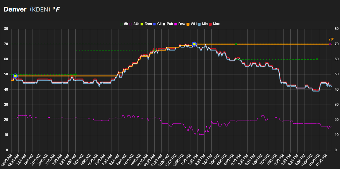
Figure 1: An example Wethr.net temperature chart showing various temperature metrics over time.
6-Hour High
The 6-hour high represents the highest temperature recorded at the station in the past 6 hours. On the chart, it is indicated by a green dot on the far right side of a dashed green line that extends 6 hours horizontally to the left at the reported temperature.
This metric is useful for understanding recent temperature peaks within a short timeframe. In instances where the 6-hour high extends into the previous day, it can not be considered reliable for determining the high of the current day and is not counted towards the Wethr High/Daily High. However, when the entire 6 hour period falls within the current day, it is extremely useful and provides reliable insight.
Figure 2: A simplified representation of the 6-hour high.
6-Hour Low
The 6-hour low represents the lowest temperature recorded at the station in the past 6 hours. On the chart, it is indicated by a light green dot on the far right side of a dashed light green line that extends 6 hours horizontally to the left at the reported temperature.
Similar to the 6-hour high, this metric is useful for understanding recent temperature minimums within a short timeframe. In instances where the 6-hour low extends into the previous day, it cannot be considered reliable for determining the low of the current day and is not counted towards the Wethr Low/Daily Low. However, when the entire 6-hour period falls within the current day, it provides reliable insight into the day's low temperature.
Figure 2b: A simplified representation of the 6-hour low.
24-Hour High
The 24-hour high shows the highest temperature recorded at the station in the past 24 hours. It is represented by a purple dot on the far right side of a dashed purple line that extends horizontally to the left across the entire chart.
Figure 3: A simplified representation of the 24-hour high (purple dot and dashed line).
24-Hour Low
The 24-hour low shows the lowest temperature recorded at the station in the past 24 hours. It is represented by a light purple dot on the far right side of a dashed light purple line that extends horizontally to the left across the entire chart.
Since the 24-hour low always extends into the previous day, it is primarily useful as a reference point rather than for determining the current day's low temperature.
Figure 3b: A simplified representation of the 24-hour low (light purple dot and dashed line).
DSMs (Daily Summary Messages)
DSMs, or Daily Summary Messages, contain both high and low temperature data for the day. The DSM High is represented by a lime green dot, while the DSM Low is represented by an orange dot on the chart. These are very important to weather market participants and can cause wild swings in the markets when they are released.
The DSM High is plotted at the time the highest temperature was observed, and the DSM Low is plotted at the time the lowest temperature was observed. These may overlap with other elements like the CLI dots, depending on the data.
Figure 4: A simplified representation of the DSM (lime green dot).
CLI (Daily Climate Reports)
CLI, or Climate Reports, contain both high and low temperature data for the day. The CLI High is represented by a blue dot, while the CLI Low is represented by a light blue dot on the chart. CLI reports are critically important to market participants and can cause large swings in price.
The CLI often aligns with the DSM but not in every circumstance. The CLI High contains the highest temperature recorded in the current day, and the CLI Low contains the lowest temperature recorded, similar to the DSM.
Figure 5: A simplified representation of the CLI (blue dot).
Hourly and Special Observations (HR+SP)
The HR+SP indicator, represented by a gold circle, marks high-precision temperature readings from Hourly (HR) and Special (SP) METAR reports. These observations are significant because they provide exact, non-rounded temperature values.
For certain markets, such as Polymarket stations (e.g., KLGA, EGLC), these precision readings are critically important. Only the temperatures marked by the HR+SP indicator are used to calculate the official 'Wethr High' for these specific locations, making them a key data point for market participants.
Figure 6: A simplified representation of an HR+SP observation (gold circle).
Public Temperature
The Public Temperature is the official temperature reading reported for the location by most weather sites, represented by the white line on the chart. The public temperature represents an oversimplified conversion from Celsius to Fahrenheit that is generally not a reliable metric when determining the high temperature.
Figure 7: A simplified representation of the public temperature (white line).
Dewpoint (DP)
The Dewpoint (DP) is represented by the magenta line on the chart. The dewpoint indicates the temperature at which air becomes saturated with water vapor, leading to condensation (e.g., dew or fog).
When the dewpoint is close to the public temperature, the Relative Humidity is high. A larger gap between the two indicates drier air.
Figure 8: A simplified representation of the dewpoint (magenta line).
Relative Humidity (RH)
The Relative Humidity (RH) is represented by the cyan line on the chart. It measures the amount of moisture in the air as a percentage of the maximum amount the air could hold at the current temperature.
This line corresponds to its own Y-axis on the right side of the chart, scaled from 0% to 100%. By default, the RH line is hidden to keep the chart clean; you can view it by clicking on the "RH" label in the chart legend.
Figure 9: A simplified representation of Relative Humidity, with its own axis on the right.
Wethr High / Daily High
The Wethr High is represented by the orange line on the chart. This line indicates the highest temperature Wethr.net can ascertain from the available public data.
It serves as a guide to help users avoid buying shares in dead brackets and as a general idea of what the high temp for the day is so far. It's important to understand however that not all information is public and non-public data isn't typically seen until the DSM is released.
Figure 10: A simplified representation of the Wethr High / Daily High (orange line).
Wethr Low / Daily Low
The Wethr Low is represented by the blue line on the chart. This line indicates the lowest temperature Wethr.net can ascertain from the available public data.
Similar to the Wethr High, it serves as a guide to help users understand what the low temperature for the day is so far. It's important to understand that not all information is public and non-public data isn't typically seen until the DSM is released.
Figure 10b: A simplified representation of the Wethr Low / Daily Low (blue line).
High Valid Through (HVT)
The High Valid Through (HVT) line is a vertical amber dashed line on the chart that indicates the point in time up to which Wethr.net can confirm the day's high temperature with certainty.
The HVT is calculated using a combination of data sources including DSM/CLI valid-through times and 6-hour high temperatures. When a 6-hour high extends into the previous day, it creates uncertainty about whether the reported high occurred today or yesterday. The HVT line only advances when this uncertainty is resolved—either by a subsequent observation matching or exceeding the uncertain value, or by receiving official DSM/CLI confirmation.
This indicator helps traders understand the reliability of the current Wethr High value. Data to the left of the HVT line represents confirmed high temperature coverage, while data to the right may still be subject to revision.
Figure 10c: A simplified representation of the High Valid Through (HVT) vertical line.
Low Valid Through (LVT)
The Low Valid Through (LVT) line is a vertical blue dashed line on the chart that indicates the point in time up to which Wethr.net can confirm the day's low temperature with certainty.
Similar to the HVT, the LVT is calculated using DSM/CLI valid-through times and 6-hour low temperatures. When a 6-hour low extends into the previous day, it creates uncertainty about whether the reported low occurred today or yesterday. The LVT line only advances when this uncertainty is resolved—either by a subsequent observation matching or going below the uncertain value, or by receiving official DSM/CLI confirmation.
This indicator helps traders understand the reliability of the current Wethr Low value. Data to the left of the LVT line represents confirmed low temperature coverage, while data to the right may still be subject to revision.
Figure 10d: A simplified representation of the Low Valid Through (LVT) vertical line.
Potential Minimum Temperature
The Probable Minimum Temperature is shown as the light blue line on the chart. This represents the lowest probable temperature for the corresponding observation time.
The Probable Minimum Temperature represents the lower bounds between itself and the Probable Maximum Temperature.
Figure 11: A simplified representation of the probable minimum temperature (light blue line).
Probable Maximum Temperature
The Probable Maximum Temperature is represented by the red line on the chart. This represents the highest probable temperature for the corresponding observation time.
The Probable Maximum Temperature represents the upper bounds between itself and the Probable Minimum Temperature.
Figure 12: A simplified representation of the probable maximum temperature (red line).
Understanding the Chart Layers Menu
The chart includes a layers menu (accessible via the layers icon) that allows you to toggle the visibility of each element. This gives you control over which data series are displayed on the chart at any given time:
- 6-Hour High: 6-hour high (green dot and dashed line).
- 6-Hour Low: 6-hour low (light green dot and dashed line).
- 24-Hour High: 24-hour high (purple dot and dashed line).
- 24-Hour Low: 24-hour low (light purple dot and dashed line).
- DSM High: Daily Summary Message high temperature (lime green dot).
- DSM Low: Daily Summary Message low temperature (orange dot).
- CLI High: Climate Report high temperature (blue dot).
- CLI Low: Climate Report low temperature (light blue dot).
- HR+SP: Hourly and Special high-precision observations (gold circle).
- Public Temp: Public Temperature (white line).
- Dewpoint: Dewpoint (magenta line).
- Relative Humidity: Relative Humidity (cyan line, hidden by default).
- Wethr High: Wethr High / Daily High (orange line).
- Wethr Low: Wethr Low / Daily Low (blue line).
- High Valid Through: HVT indicator (amber vertical dashed line).
- Low Valid Through: LVT indicator (blue vertical dashed line).
- Temp Low: Probable Minimum Temperature (light blue line).
- Temp High: Probable Maximum Temperature (red line).
The layers menu helps you customize your view by showing only the data series that are relevant to your analysis. Your visibility preferences are saved automatically for logged-in users.